
Learn - Themes and Icons
Colors, fonts, and icons, chosen per budget.
Themes and Icons
A theme sets the colors and the fonts a budget is drawn with. An icon set supplies the icons on its accounts, categories, and flows. You choose both per budget, so a personal budget can run dark and minimal while a household budget runs bright and colorful in the same app. Picking a theme costs nothing, building your own costs nothing, and the community library is open to every plan.
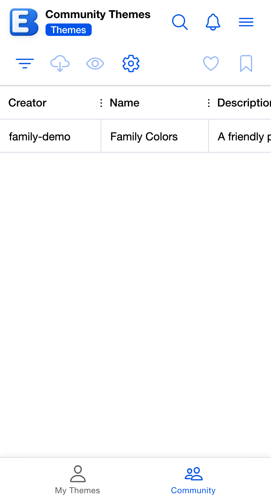
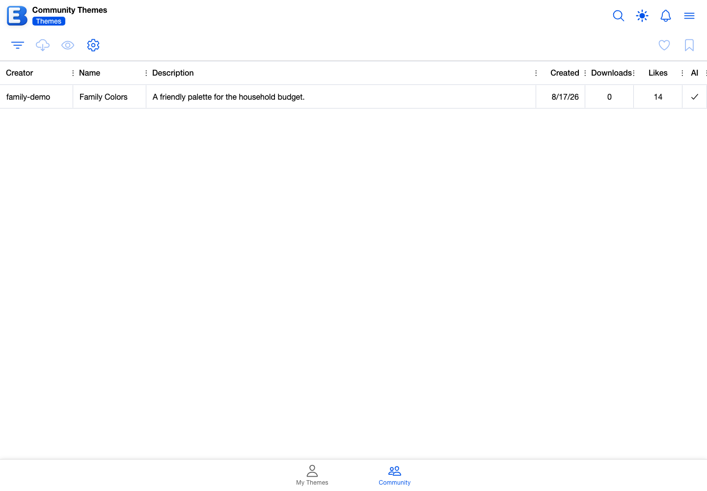
Where themes and icon sets live
Open the hamburger menu. Themes opens the Themes page and Icons opens the Icon Sets page. Each page has two tabs along the bottom: your own library, and Community.
Your library holds everything you have made and not yet published. The Community tab holds everything anyone has published. The first time you open a Community tab, the app asks you to accept its community content terms; the tab stays empty until you do.
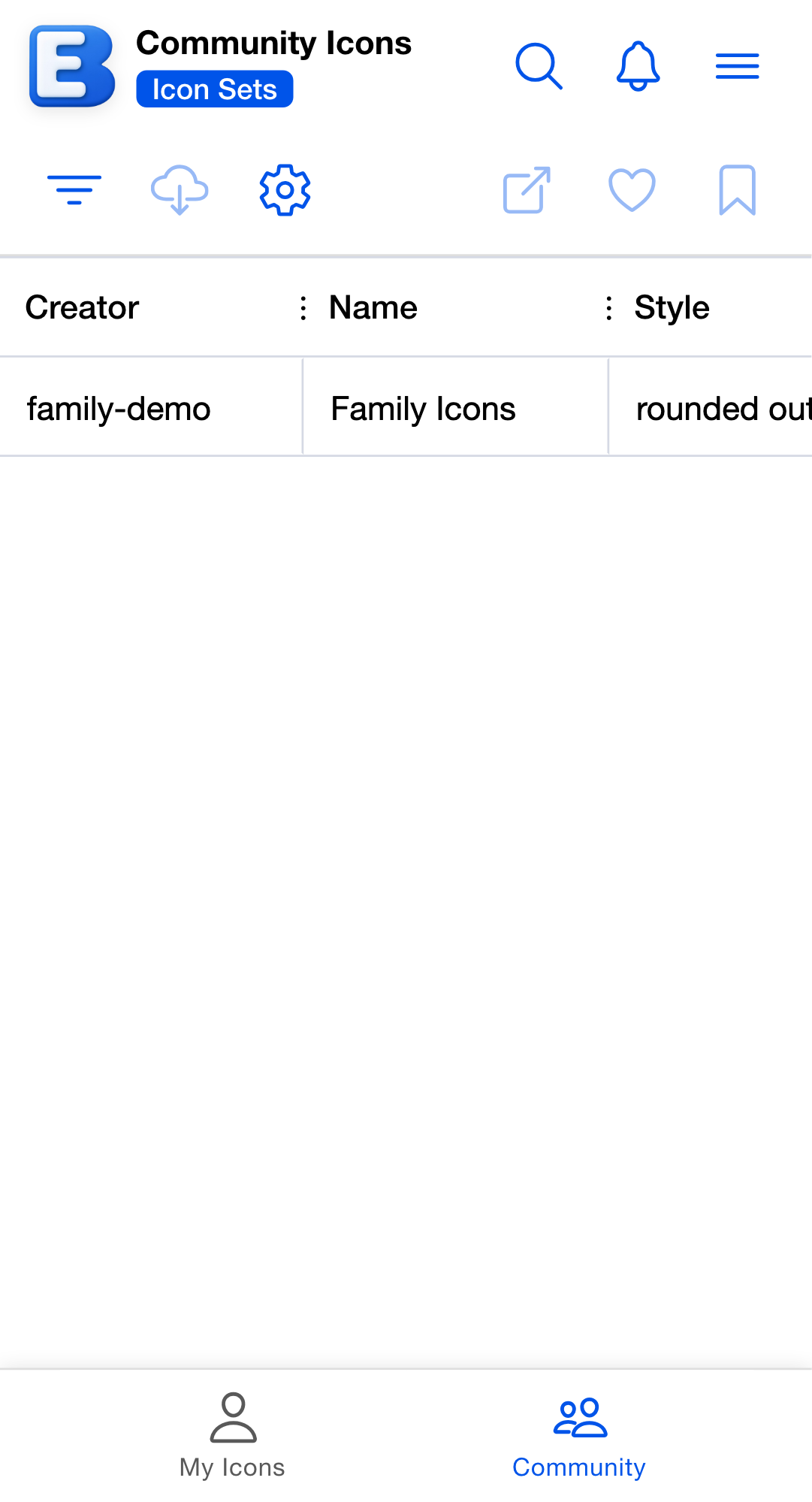
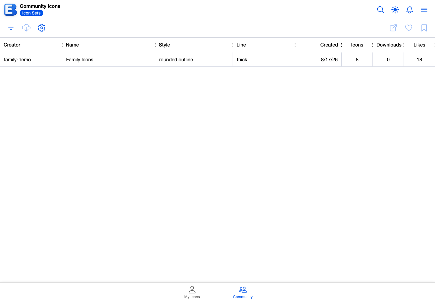
Tap a row to select it. Selecting a theme previews it immediately across the whole app, so you can judge it against real screens before you commit it to a budget. To open the selected row, double-tap it, or tap Edit Theme on your own tab and View Theme on Community. Icon sets open through Open Icon Set on either tab.
The toolbar’s Filter button sorts the Community tab by All, Most Popular, Most Downloads, Most Recent, Most Liked, or Bookmarked. The search icon in the header searches names and descriptions.
Picking a theme for a budget
Open a budget’s Edit Budget dialog from the Budgets list and tap the Theme row. The Select Theme dialog opens on two segments, My Themes and Community.
The first row in either segment is Default Theme, described as “Use the system default theme”. It clears any theme from the budget. Below it, your themes or the public library appear as a radio list.
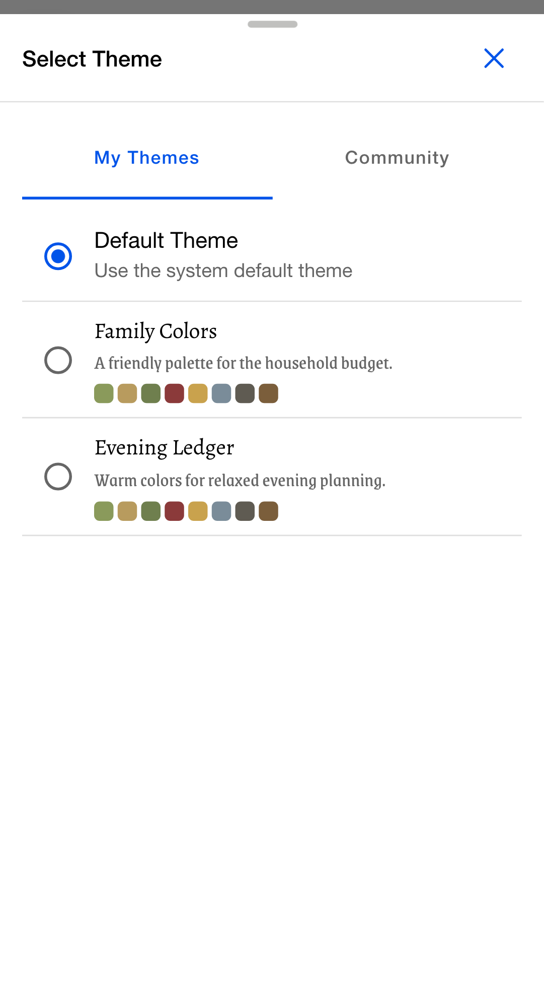
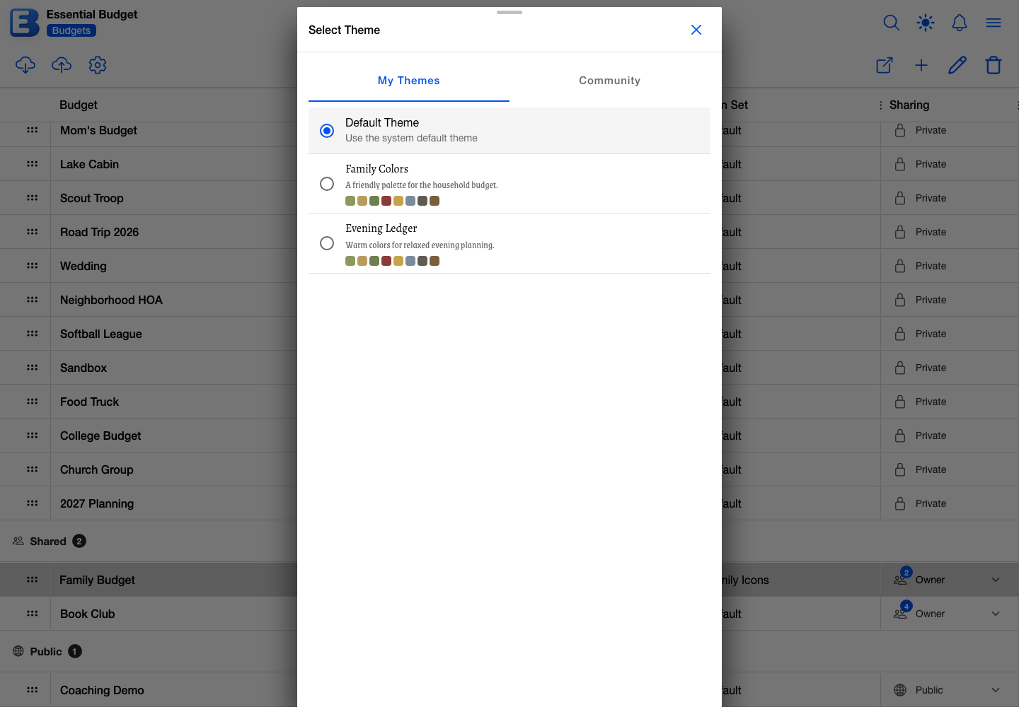
Tapping a theme closes the picker and previews it right away, but nothing is saved to the budget until you tap Save in Edit Budget. Close the dialog instead and the budget keeps the theme it had.
The Icon Set row works the same way, through a Select Icon Set dialog whose default row is Default Icons. Icon sets have no live preview; the change shows once the budget is saved.
On the Community segment, each row carries a bookmark toggle and a like button. Bookmarking files the theme under the picker’s own Bookmarked filter. Liking adds to a public count other people see. Neither one copies the theme into your library.
Why this default? Picking a theme leaves nothing behind. Choosing a community theme points the budget at the original rather than copying it into your library. The person who made it can no longer change it once it is published, so the version you picked is the version you keep. To get an editable copy of your own, download it and restore it, described under Backing up and restoring a theme.
What a theme contains
A theme carries four things, all of them stored together:
- Fonts. A heading font and a body font, each with its own size, adjustable from 75% to 125% of normal, and its own weight, from 100 to 900.
- Interface colors. Backgrounds and surfaces, text, borders, the primary, secondary, and tertiary brand colors, and the status colors for success, warning, danger, and info.
- Grid colors. The alternating row and column shading, and the lines between them, used by every data grid in the app.
- Category and chart colors. One Income color, plus a palette of 8 to 12 colors that give each category, account, and chart series its own identity.
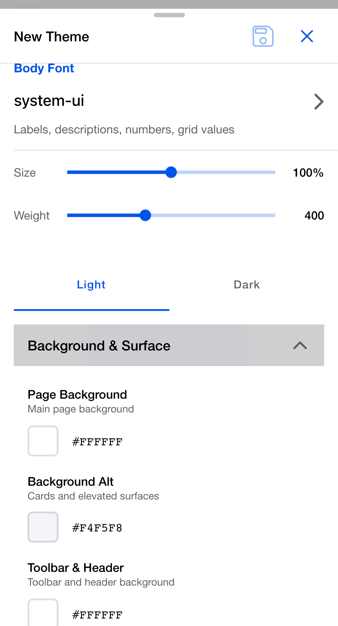
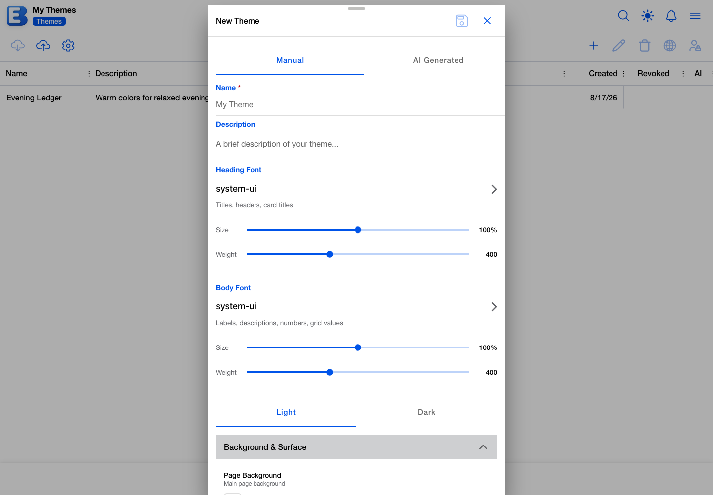
Every theme holds a light variant and a dark variant of its colors. Settings switches between them, in the Theme Variant section covered by Accessibility, and a sun or moon button in the app header does the same when the header has room for it. The fonts are shared: changing a font changes it in both variants at once.
Why this default? The palette lives in the theme, not the icon set. Palette colors are applied to icons as they are drawn, so one icon set can look like warm earth tones under one theme and cool neons under another. Edit a theme once and every icon in every budget using it follows.
Building a theme by hand
On your Themes tab, tap New Theme and choose the Manual segment. On a free plan the dialog already opens there; on Premium it opens on AI Generated.
Give the theme a name, up to 50 characters. Names have to be unique in your library, and a clash blocks Save with the message that a theme of that name already exists. The description below it is optional and holds up to 200 characters.
Your library holds up to 10 themes on the free plan and 50 on Premium. Every theme on your Themes tab counts toward it, whether you built it by hand, generated it with AI, or restored it from a backup. At the cap, Save is refused with a message that the theme limit is reached; delete a theme you no longer use to make room. See Subscription.
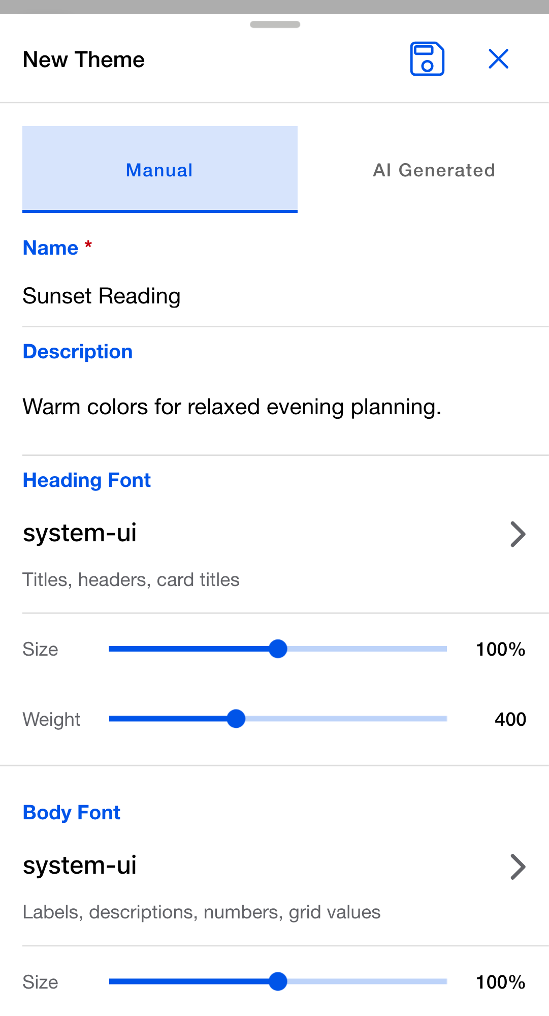
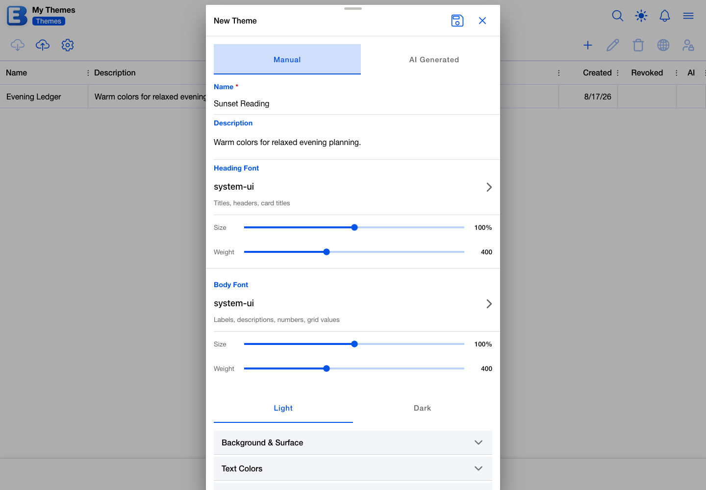
The fonts come first. Tap Heading Font or Body Font to search the Google Fonts catalog, then set that font’s size and weight on the two sliders beneath it. Below the fonts, a Light / Dark segment picks which variant you are editing, and the color groups expand one at a time. Each color is a hex value you can type or pick.
Colors are set per variant, so a theme that should look different in dark mode needs both passes. Save when it looks right, and the theme is available in the picker straight away.
Editing a saved theme
Select a theme on your Themes tab and tap Edit Theme, or double-tap its row. The Edit Theme dialog is the same editor, with the name and description editable too.
Two kinds of theme are read-only, and both open as View Theme instead. A community theme belongs to whoever published it. A revoked theme is one you have deliberately locked, described under Revoking a theme or icon set. In both cases the toolbar’s Edit and Delete buttons are disabled and say why.
Generating a theme with AI
Switch the New Theme dialog to AI Generated. Generating a theme is part of Premium; on the free plan the segment shows a subscribe prompt in place of the form.
Name the theme, then describe what you want. The Style Preset list offers Custom (use description) plus twenty ready-made looks, from Americana and Candy Pink through Minimal, Neon, and Tuxedo, each with a one-line summary. Pick a preset and the description field becomes Additional Description, for refinements. Pick no preset and a description is required.
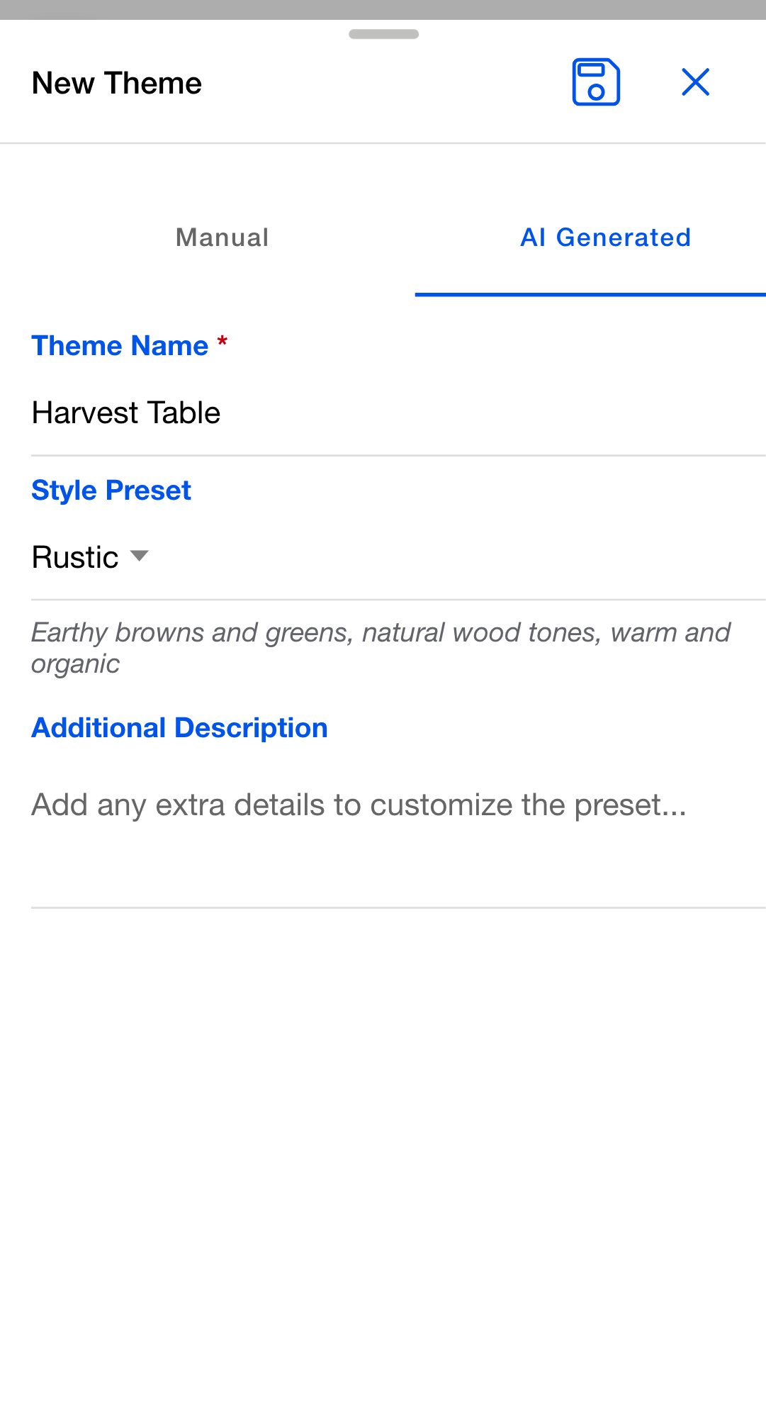
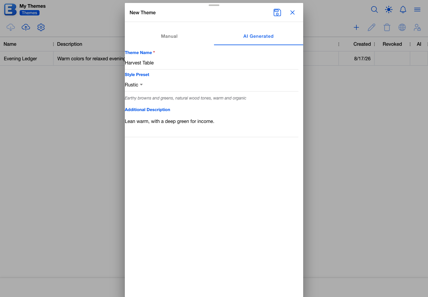
The app generates the whole theme, both variants and the palette, and saves it to your library. The dialog shows a progress indicator noting that it usually takes 1 to 2 minutes, and stops with an error if it passes two. A Theme Created Successfully! dialog then asks which of your budgets to apply the new theme to.
Generating a theme costs about 2 credits against the monthly allowance that comes with Premium. That allowance is 500 AI credits, and every AI feature draws on the same pool, including budget creation and receipt scanning. See Subscription for how the pool is spent and what is left.
A description that trips the content filter is refused with a Content Filter notice asking you to rephrase. Nothing about your budget, accounts, or transactions is sent either way; the AI receives your preset choice and your description and nothing else.
Backing up and restoring a theme
Select a theme and tap Download Theme. The app saves a ZIP file holding the full theme: both variants, every color, the palette, and the fonts. Downloading a community theme adds a copy of the CC0 license to the ZIP.
To bring one back, tap Restore Theme on your Themes tab. The dialog walks through three steps: choose the file, confirm the name, and review. Drop the backup onto the upload area or click to browse for it. Both .zip and .json backups are accepted, up to 20 KB.
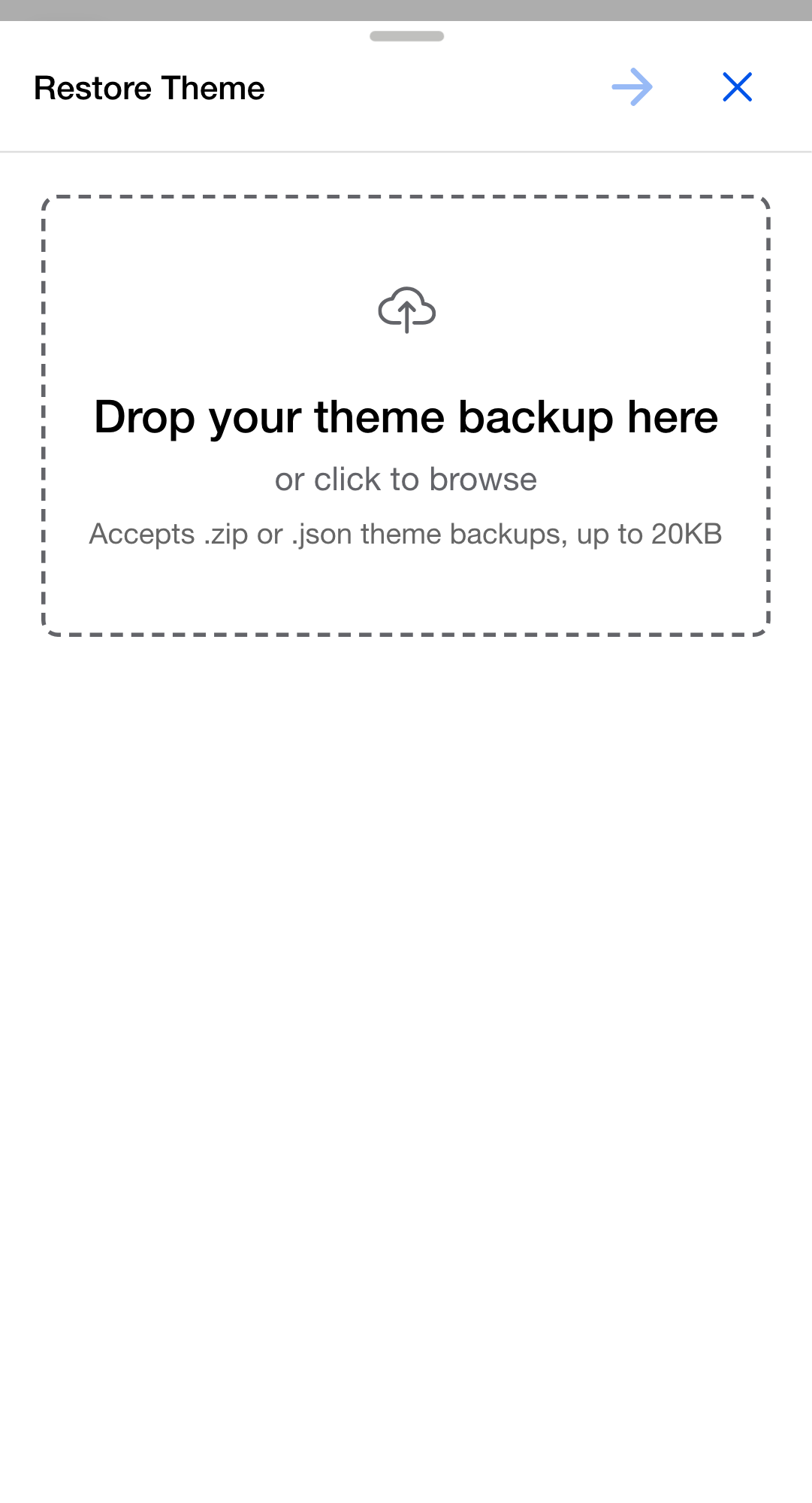
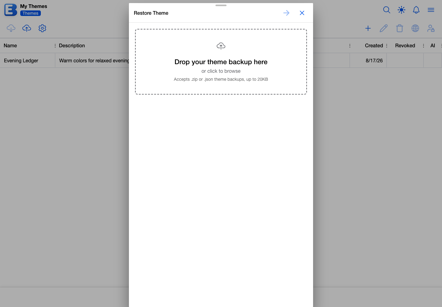
The name step suggests the name stored in the backup, and adds a number in brackets when your library already has one by that name.
Why this default? Restoring always makes a new theme. There is no restore-over-the-top mode, so a backup can never overwrite the theme you are working in today. To roll a theme back, restore the backup alongside the current one, compare them, and copy across what you want.
Restored themes are always private, even when the backup came from a published community theme. That is also the only way to get an editable copy of someone else’s theme: download it from the Community tab, then restore it.
Publishing a theme or icon set
Publishing releases your work to everyone in the app under your username. Select the theme or icon set on your own tab and tap Publish Theme or Publish Icon Set.
Publishing requires Premium, as part of Community Publishing, and without it the dialog offers to upgrade instead. You also need a username, and the dialog offers an Edit Profile button to set one. Icon sets need at least 20 icons on top of that; below the bar the dialog shows More Icons Needed and counts how many you have.
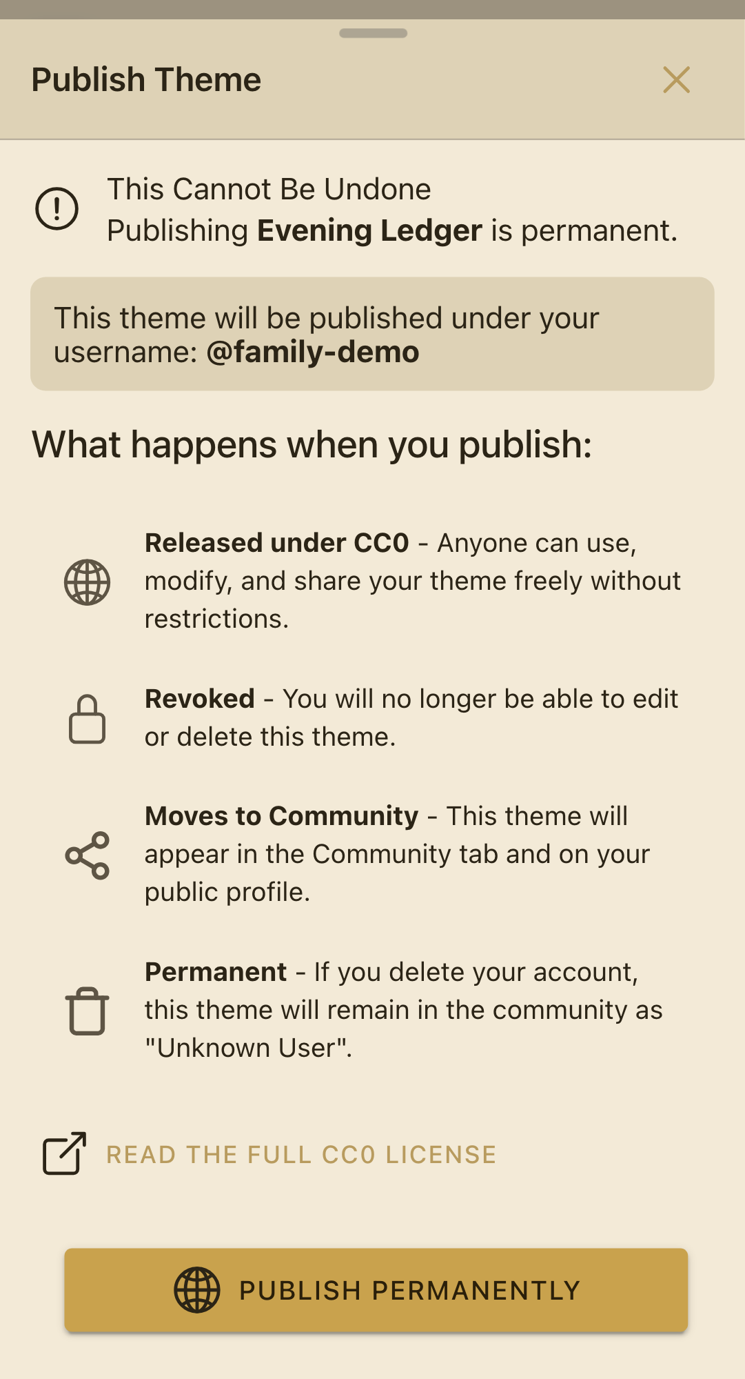
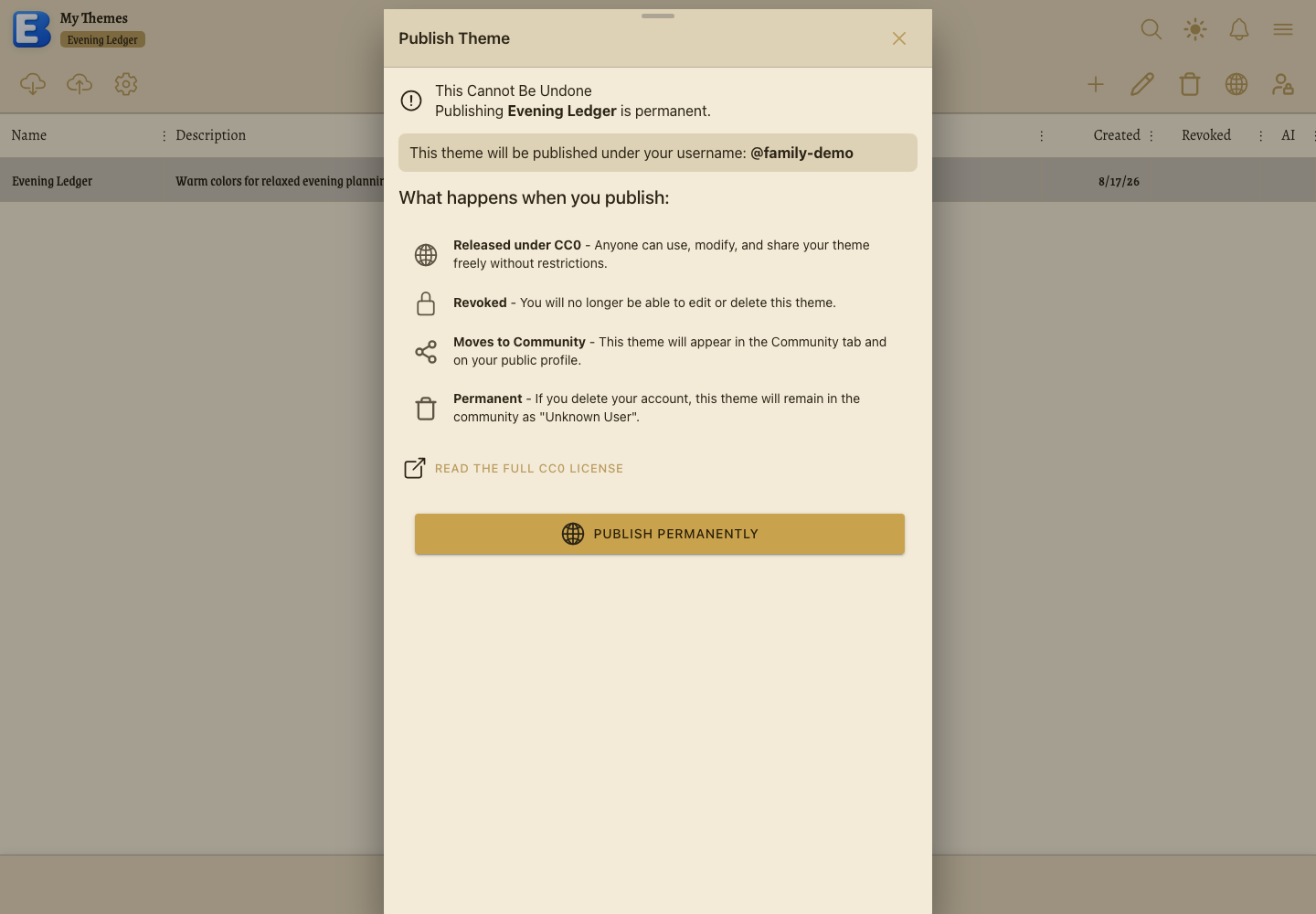
The dialog spells out all four consequences before you confirm:
- Released under CC0. Anyone can use, modify, and share your work freely, with no restrictions and no need to credit you.
- Revoked. You can no longer edit or delete it, in your own library or anywhere else.
- Moves to Community. It leaves your tab and appears in the Community tab and on your public profile.
- Permanent. If you delete your account, it stays in the community under “Unknown User”.
The name and the description you publish are checked against the app’s content rules first, and a publish that fails those checks is refused with a note saying so. You can publish up to 50 themes and 50 icon sets a month.
Why this default? Publishing is one-way. A published theme cannot be pulled back, even by you, because other people’s budgets may already be pointing at it. To release a revised version, download the published one, restore it as a new private theme, edit that, and publish the result separately.
Revoking a theme or icon set
Revoking gives up your own edit and delete rights without releasing anything publicly. It is the middle option: the theme stays in your library, every budget using it carries on unchanged, and you can still publish it later if you change your mind.
Select the theme and tap Revoke Theme. The dialog names the three consequences: you lose edit access, shared access continues, and you can still publish.
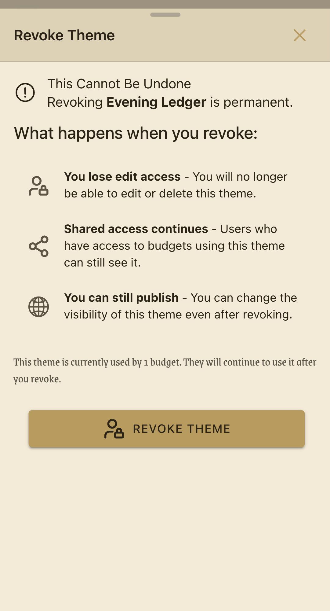
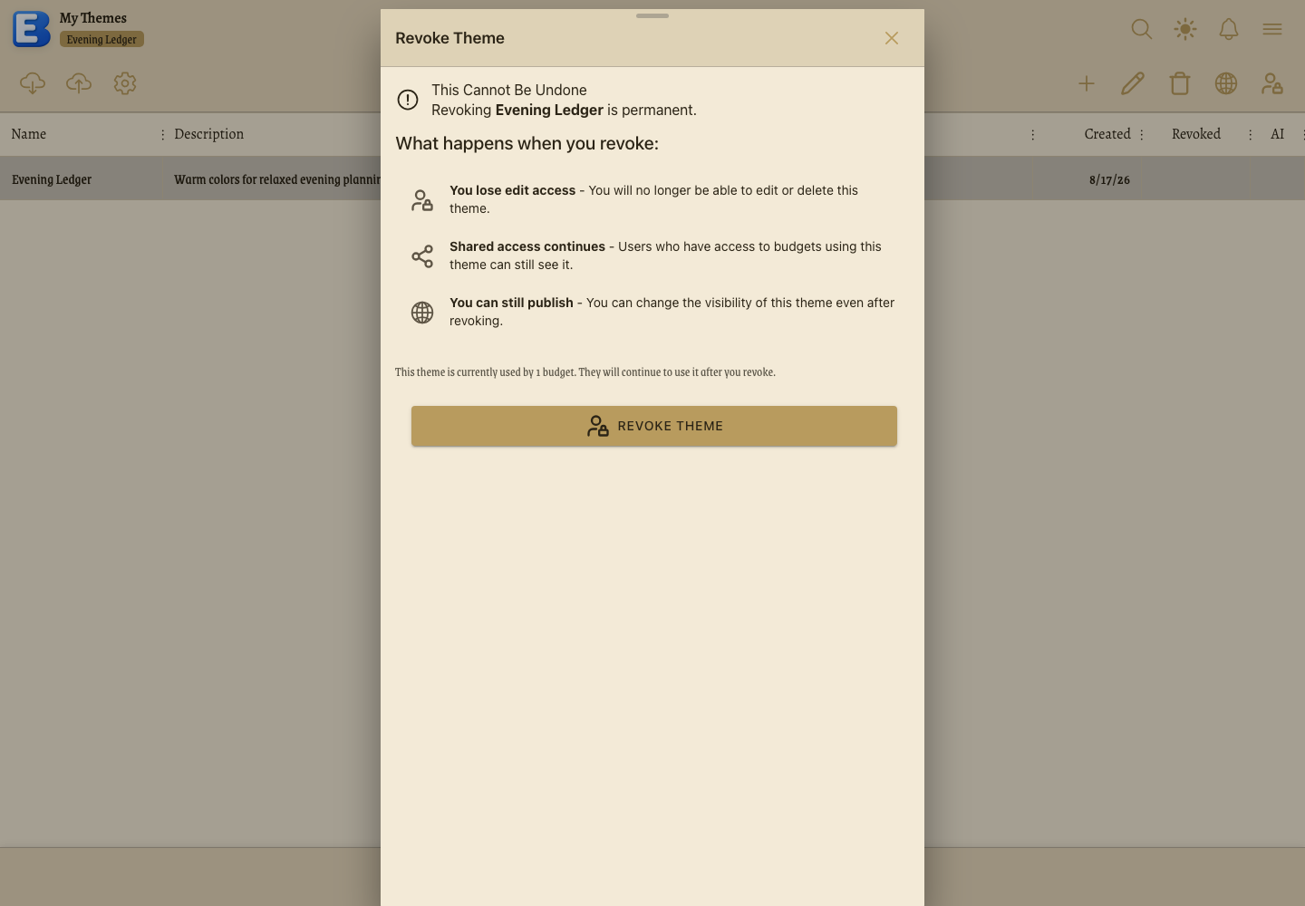
Why this default? Revoking is for stepping back, not for sharing. Publishing locks the work and hands it to everyone. Revoking locks the work and hands it to nobody. It fits the case where a theme is finished and shared with family, and you want to be sure you cannot break it by accident.
Revoke Icon Set does the same for an icon set.
Deleting a theme or icon set
Select a theme on your Themes tab and tap Delete Theme. When no budget is using it, a short confirmation appears and deleting is immediate.
When a budget is using it, a Theme In Use dialog opens instead, headed “Cannot Delete”. It names the budgets you can see, counts any you cannot, and offers two ways forward.
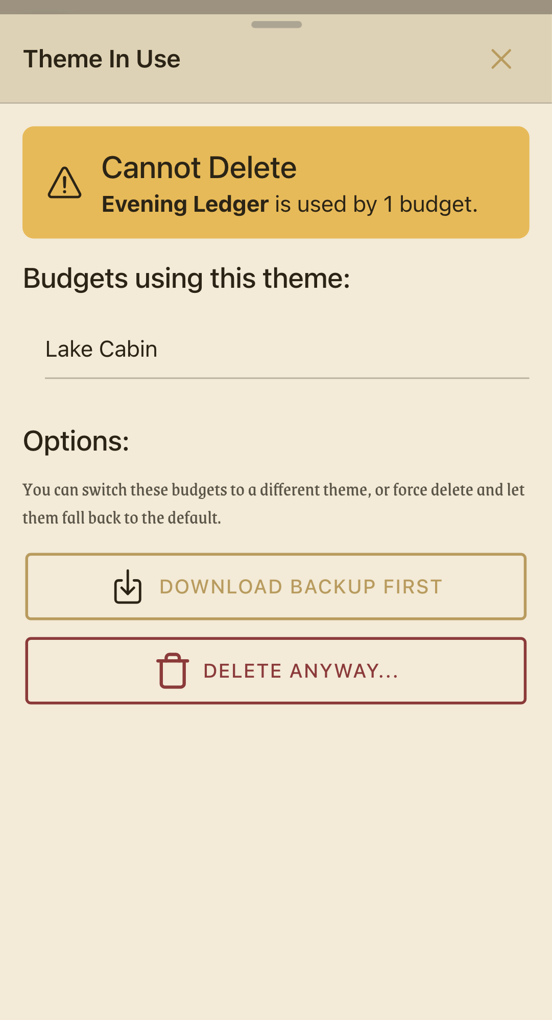
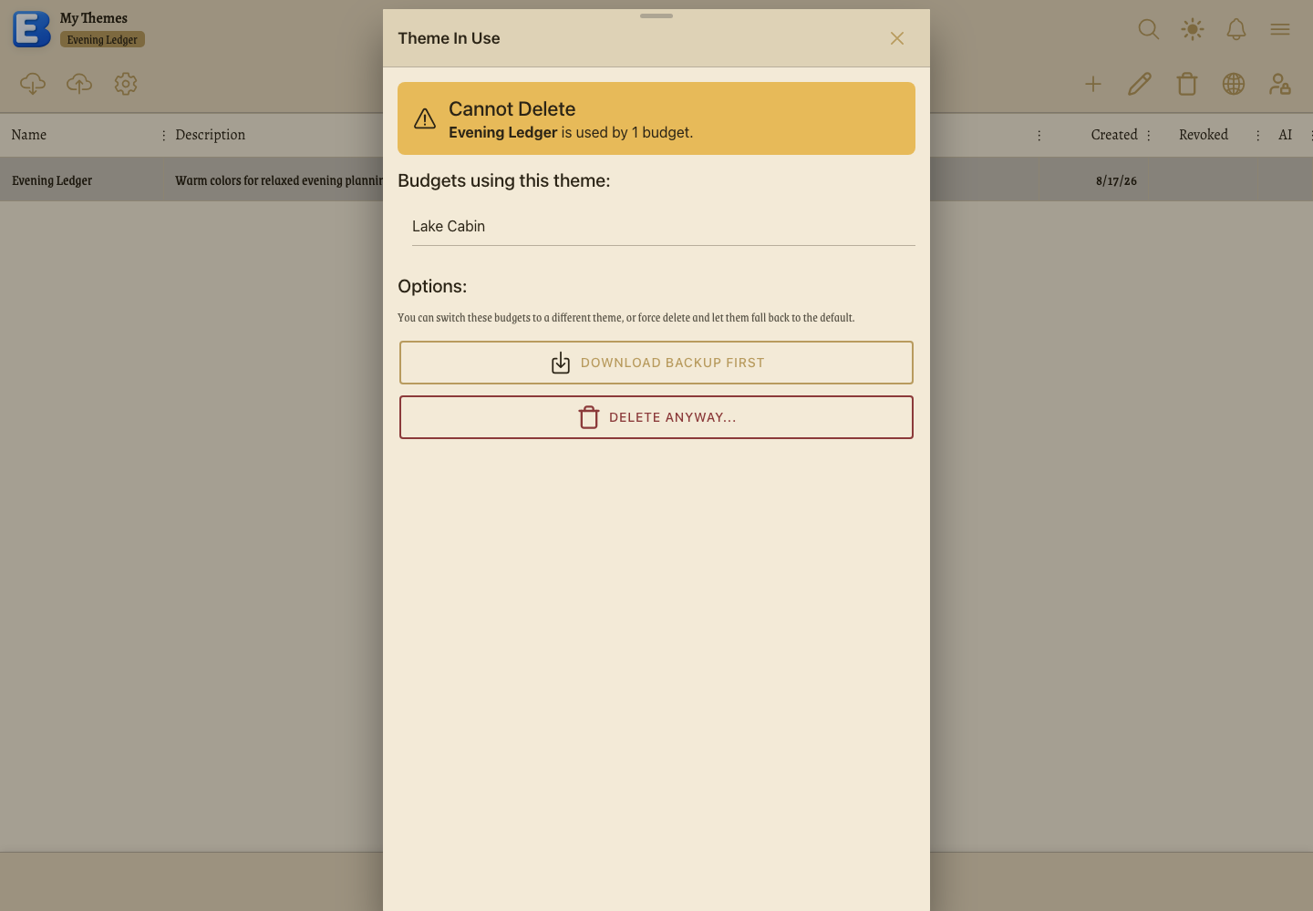
Download Backup First saves the ZIP before you remove anything. Delete Anyway… asks once more, warning that the budgets will fall back to the default and that this cannot be undone, and only Yes, Delete finishes the job. Every budget pointing at a deleted theme falls back to the default for everyone on it, and the icons in those budgets take their colors from the default palette instead.
Why this default? Deleting a theme never deletes anything else. A theme holds colors and fonts and nothing more, so removing one changes how budgets look and leaves their accounts, categories, flows, and history untouched. That is why the app lets you delete a theme budgets are still using, once it has told you which ones: there is no data to lose, only an appearance to reset.
Revoked themes cannot be deleted at all; the toolbar button is disabled and reads “Cannot delete revoked theme”. Published themes never appear on your tab in the first place, so there is nothing there to delete.
Delete Icon Set works the same way.
Creating an icon set
Open Icons from the hamburger menu and tap New Icon Set on your tab. If your library is empty the dialog opens on its own.
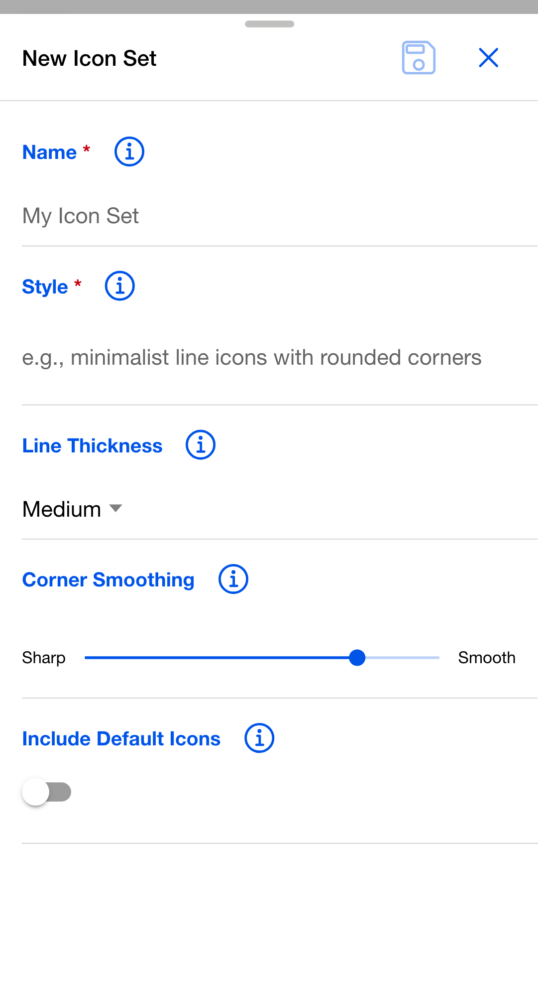
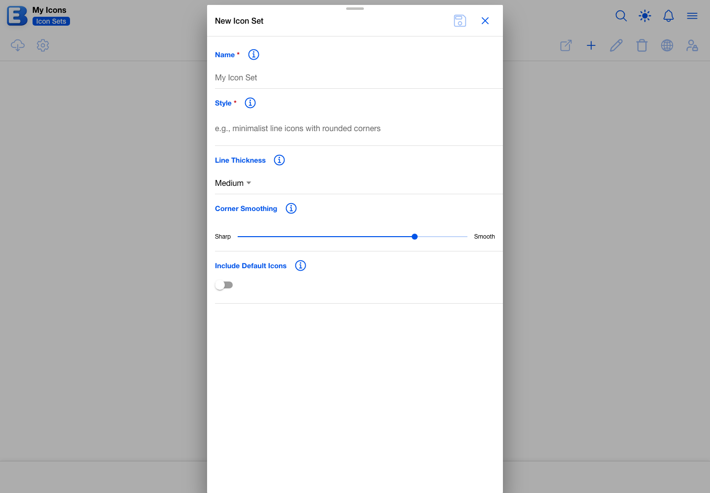
The dialog asks for five things. Name is required, up to 50 characters. Style is required, up to 100 characters, and describes the look you want (“minimalist line icons with rounded corners”); the app hands it to the AI with every icon you generate. Line Thickness is Thin, Medium, or Thick, and starts on Medium. Corner Smoothing is a slider from sharp angles to fully rounded. Include Default Icons seeds the set with the app’s own icons so you can replace them one at a time; leave it off and the set starts empty.
Saving takes you into the set and opens the Add Icon dialog straight away. Each icon needs a name and a description of what it should look like, and the app generates it from those together with the set’s style. The toolbar inside a set holds Add Icon, Edit Icon, Delete Icon, and a generate button that redraws whatever you have selected.
Generating icons spends Icon Generation Credits, which are bought in packs and are separate from the AI allowance that themes draw on. One icon costs 1 credit on Fast, 2 on Standard, or 3 on High. See Subscription for pack prices and the 90-day expiry.
Downloading an icon set
Select an icon set on either tab and tap Download Icon Set. The app saves a ZIP straight away, with no confirmation step.
Inside are a manifest.json describing the set, an icons folder holding one SVG per icon, and an index.html gallery you can open in a browser to see them all at once. Downloading from the Community tab adds the CC0 license as well, so it is clear the icons are in the public domain.
There is no restore for icon sets. The ZIP is for using the icons elsewhere, not for rebuilding a set inside the app. To use a community icon set, pick it in the Select Icon Set dialog.
Themes on shared budgets
A budget has one theme and one icon set, and both belong to the budget rather than to whoever chose them. Everyone with access sees the same thing, and changing either one changes it for all of them.
The theme itself still belongs to whoever made it. If your partner owns the budget but the theme on it is yours, only you can edit or delete that theme. They can point the budget at a different theme whenever they like, and your library is untouched.
Deleting a theme a shared budget is using drops that budget back to the default for everyone on it. The Theme In Use dialog names those budgets before you confirm, and offers to save a backup first.
What changes if Premium ends
Your library is yours. Themes and icon sets stay, and every budget already using one keeps showing it. Community themes and icon sets stay available to pick on every plan.
- AI Theme Generation needs Premium. The AI Generated segment still appears and shows a subscribe prompt instead of the form. The manual editor stays open on every plan.
- The library cap returns to 10. Nothing is removed if you have more than that, but you cannot add another theme until you are under 10 again.
- Publishing needs Premium. Themes and icon sets you have already published stay in the community; nothing is withdrawn from the people using them.
- Icon Generation Credit packs you bought stay yours, with their original 90-day expiry. The 100-credit bonus granted when you first subscribed is withdrawn.
See Subscription for the full list, and Your Account for where to cancel.
Quick reference
| If you want to… | Do this |
|---|---|
| Change a budget’s colors or fonts | Edit Budget, tap Theme, pick one, then Save |
| Change a budget’s icons | Edit Budget, tap Icon Set, pick one, then Save |
| Go back to the stock look | Pick Default Theme or Default Icons in the picker |
| Build a theme yourself | Themes page, New Theme, Manual segment |
| Generate a theme from a description | Themes page, New Theme, AI Generated segment (Premium) |
| Find a community theme | Themes page, Community tab, Filter to sort, header search to search |
| Get an editable copy of a community theme | Select it on Community, Download Theme, then Restore Theme on your tab |
| Back up a theme | Select it, Download Theme (a ZIP) |
| Restore a theme | Restore Theme, drop or browse to the file (20 KB limit) |
| Release your work to everyone | Publish Theme or Publish Icon Set (Premium; icon sets need 20 icons) |
| Lock a theme without publishing it | Revoke Theme |
| Get an icon set’s SVGs out of the app | Select it, Download Icon Set |
| Delete a theme a budget is using | Delete Theme, then work through the Theme In Use dialog |
Behind the scenes
Why the palette has a floor and a ceiling. When a theme carries a palette, the app accepts it only at 8 to 12 colors, and it rejects anything outside that on the way in, whether the colors came from the generator or from a restored backup. The palette is what colors category icons, account badges, and chart segments in turn, so too few colors and neighboring items repeat sooner, too many and the last ones are rarely reached. The color editor shows the palette a theme already has and gives no way to add or remove entries, so a theme you edit by hand keeps the count it started with.
What is in a theme backup. A ZIP holding one JSON file: every color in both variants, the palette, the fonts, the name, the description, and a note of whether the theme was AI generated. There is no history, no usage data, and no reference to any budget, so the file moves between accounts and devices freely. Community downloads add LICENSE.txt.
What is in an icon set download. A ZIP holding manifest.json, an icons folder of SVGs, an index.html gallery, and LICENSE.txt on community downloads.
What the AI receives. For a theme, your style preset and your description text, and nothing else. For an icon, the icon’s name and description plus the set’s style, line thickness, and corner smoothing. No budget, account, category, transaction, or bank data is sent on either path. See Subscription.
Related pages
- Subscription: what Premium covers, how the monthly AI allowance and Icon Generation Credits work, and what changes when Premium ends.
- Your Account: full-budget backup and restore, and the profile page where you set the username publishing needs.
- Accessibility: the Theme Variant toggle that switches a theme between its light and dark colors, plus text size and date format.
- Discover: the most-liked community themes, icon sets, and individual icons.
- Your Public Profile: where your published themes and icon sets are listed.
- Sharing a Budget: collaborators see whichever theme and icon set the budget carries.
Questions or feedback about this page?Email us.