
Learn - Receipt Reports
What your receipts know about your prices.
Receipt Reports
Once you have scanned a few grocery receipts, the app turns their line items into six reports: this month at a glance, what you spend, what you pay per product, where each product is cheapest, what your area pays, and a shareable recap. Every number is built from receipts you actually scanned, and all six reports are free for everyone.
Open the reports from the Reports button at the top of the Receipts tab, or from the Reports tab itself: tap Select Report and pick one under the Receipts group.
- Overview: this month at a glance.
- Spending: what you paid on receipts each month, stacked by department or by store.
- Price History: every price you paid for a product over time, per unit.
- Stores & Savings: which store charges what for each product, and what switching could save.
- Area Prices: what shoppers near you pay, once you contribute your prices too (see Community Prices).
- Recaps: your shareable month and year summaries.
Every number states what it is based on (“Based on 14 receipts, Jan 10 to Jul 3”). A number that does not have enough history behind it yet says Building instead of guessing. Returns and receipts still waiting in the review queue never count.
Why don’t receipts in review count yet? A receipt waiting in the review queue has not been confirmed, so its prices could be misread. The reports only count receipts that scanned cleanly and are not in review. Confirm a receipt from the review queue, and it joins your reports.
Overview
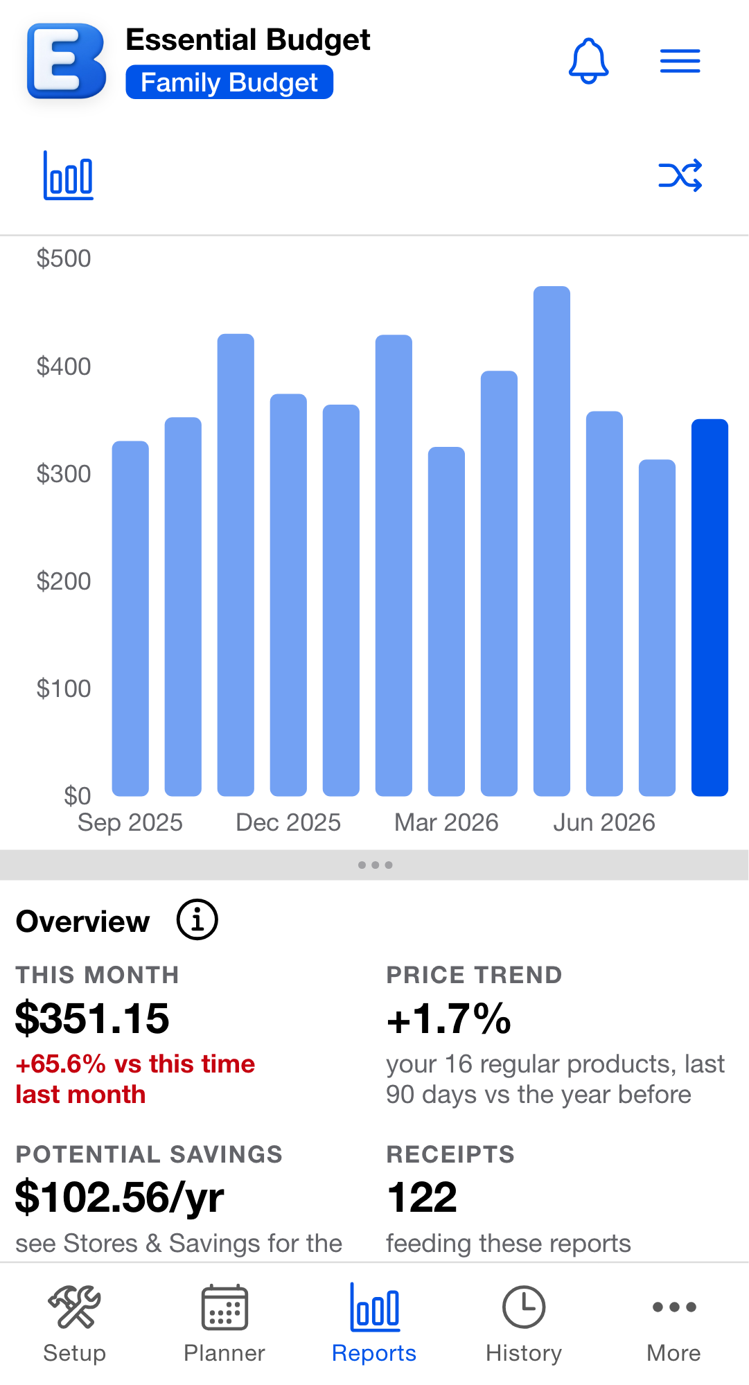
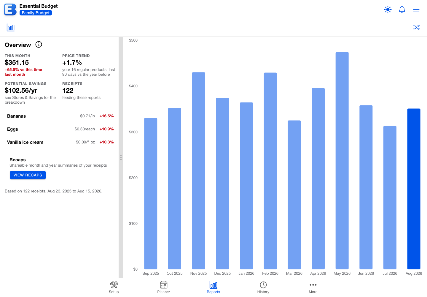
Overview is the landing report: this month’s receipt spending compared with the same days last month, your price trend, your potential savings for the year, and the products whose prices moved most. The chart shows your last twelve months of receipt spending. The recap card lives here too; tap View recaps to open the Recaps report.
The month comparison is fair by design: on the 10th of a month, it compares against the first ten days of the prior month, never against the prior month’s full total.
Spending
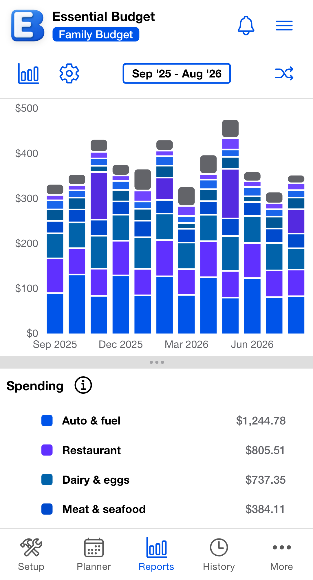
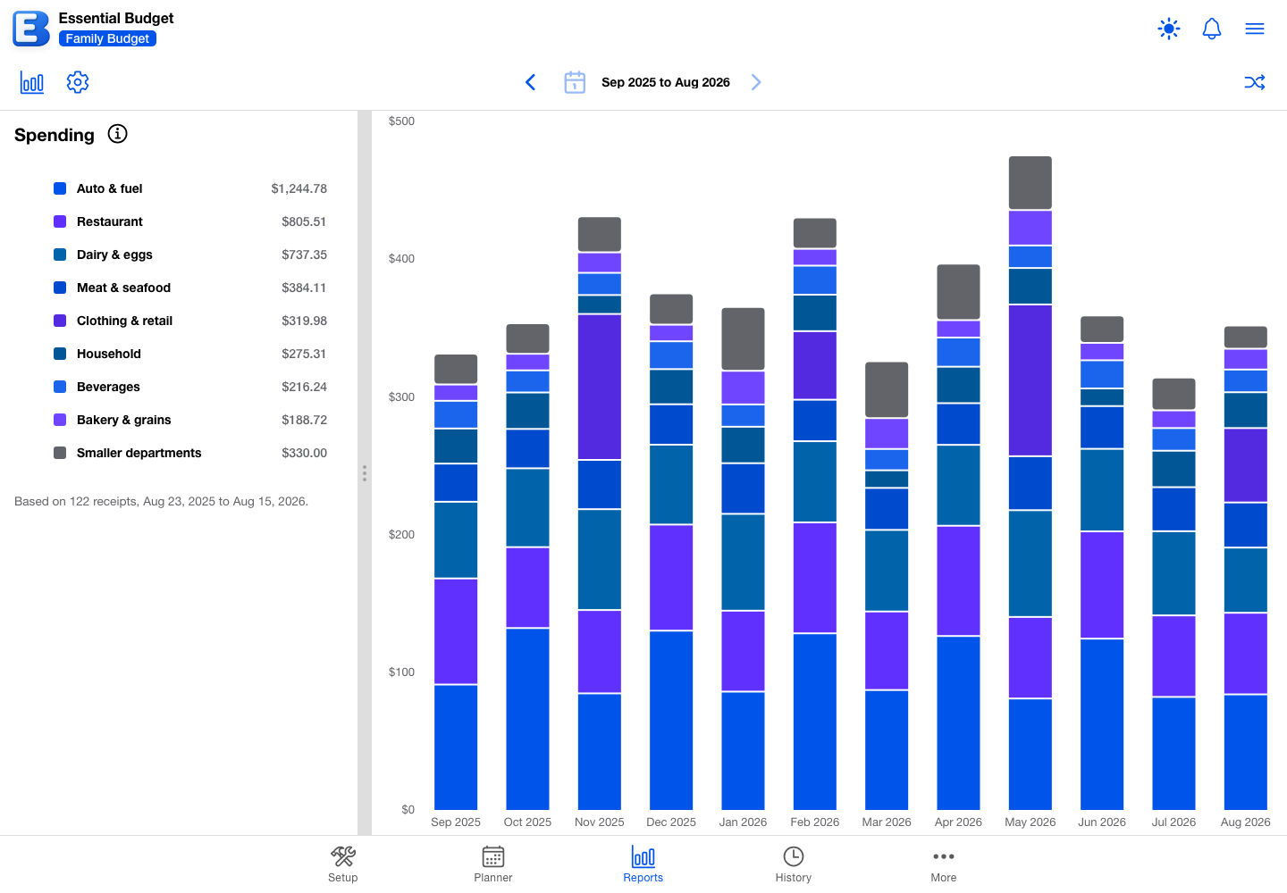
Spending stacks your receipt totals, including tax, by department (Produce, Dairy & eggs, Household, and so on) or by store. To switch between the two, open the chart settings with the gear button at the top of the report and choose Departments or Stores.
The date range control above the chart sets the bar size: Monthly shows twelve monthly bars, Quarterly shows eight quarterly bars, and Yearly shows five yearly bars. The arrows step through older periods, up to five years back. A bar’s stack always adds up to the money you actually paid. Tap a segment to highlight that department or store across the chart and the legend; the tooltip then shows that segment’s amount alongside the bar’s total. Tap the bar off any segment for the bar’s total, receipt count, and largest segments, and tap empty space to clear. The chart shows your eight biggest departments or stores individually; anything beyond them stacks into a single segment named Smaller departments or Smaller stores.
Price History
Price History shows what you actually paid for a product, per unit, over time. Prices are compared fairly: a 2-gallon jug of milk and a 1-gallon jug both count as a price per gallon, and a product printed without a comparable size is priced per package instead, never mixed into the per-unit numbers.
Pick a product from the list, which puts your biggest spending first. The list shows your top 50 products; a search field above it finds any other product you have bought, by the app’s product name or the name printed on your receipts. Each dot on the chart is a real purchase on a real time axis, and a line in each store’s color connects that store’s purchases. To choose how products are labeled, open the chart settings with the gear button at the top of the report and pick Receipt names (the way your receipts print them) or Product names (the app’s clean product names); either way, a product’s history is matched across stores and name variations. Every product’s row expands to the names your receipts printed for it, each with its purchase count: pick one to chart that name’s history alone. When you pick a product, the chart opens on the tightest period that shows its whole history. The date range control above the chart zooms the view from there: choose Weekly, Monthly, Quarterly, or Yearly, and use the arrows to move between periods; when the visible period hides some purchases, a line in the side panel counts them (“Showing 2 of 6 purchases”). The side panel always covers your full history: your latest price, your best price with its store and date, and your typical price at each store. The best price you ever paid is marked with a star whenever it falls inside the visible window. Tap a dot, and a button names that purchase (“View the Apr 12 receipt”); tap it to open the receipt behind that exact price.
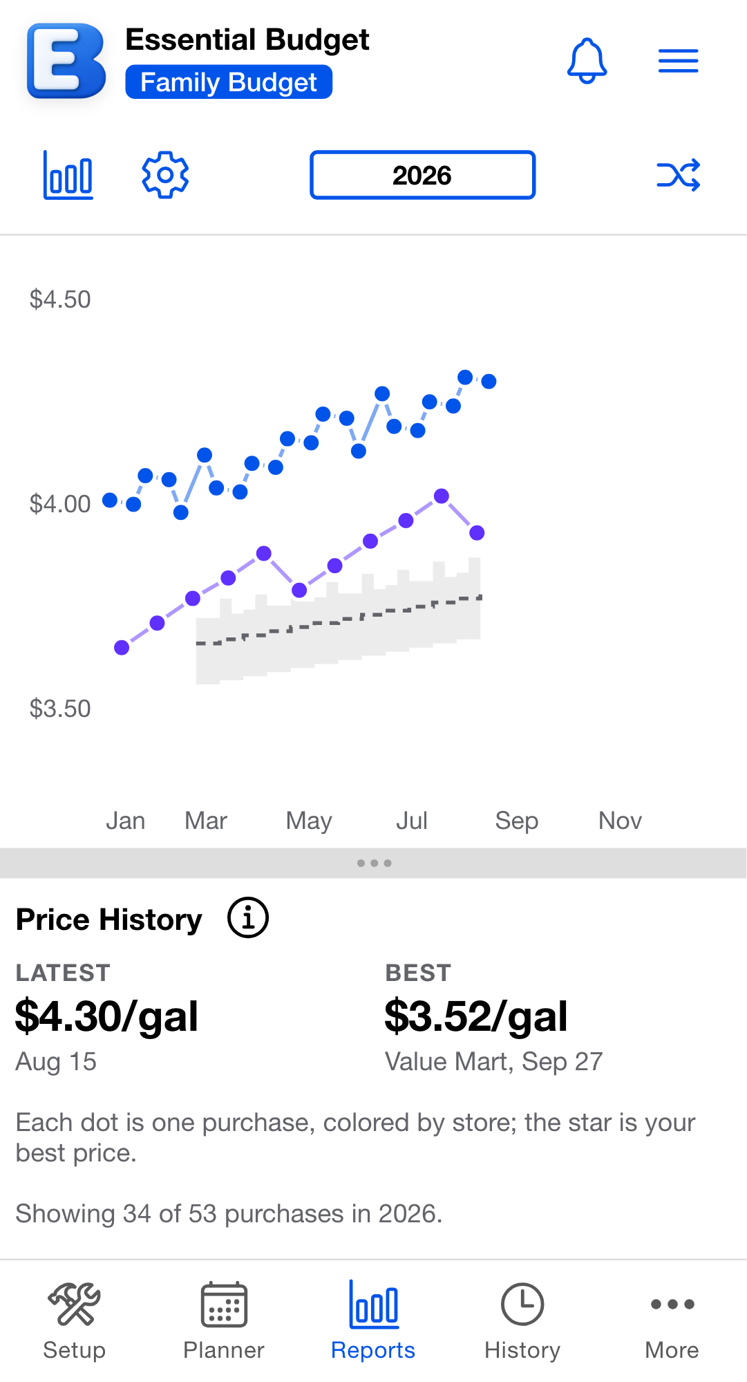
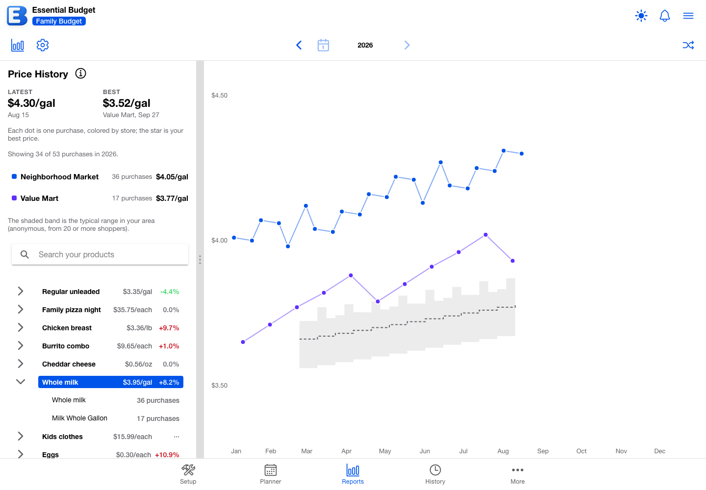
A product’s price change appears only when there is enough history behind it: at least four purchases across three months, some recent and some from the year before. Until then, the list shows dots instead of a percentage. If a product’s package quietly changed size, a note under the chart says so (for example “Package size shrank: 64 fl oz to 59 fl oz”). The per-unit prices already account for the change, which is exactly how shrinkflation shows up: as a per-unit price increase.
Stores & Savings
Stores & Savings lines up each product you buy repeatedly across your stores: what each store typically charges per unit over the last twelve months, and what buying at the cheapest reliable source would save you per year at your usual quantities. A store needs at least two purchases of a product to be compared, and a product without enough history says “building history” instead of showing an estimate.
Each product row carries a price strip: a horizontal price line from the row’s cheapest source to its priciest. Along the strip:
- a solid marker states each store’s typical price, and every store keeps its own shape and color (circle, square, triangle, or ring) so two stores never look alike, even when their colors run close;
- a star marks the cheapest reliable source, the store the row’s savings figure is based on;
- a small tick marks what you typically pay;
- a diamond marks your area’s median, when Community Prices is on.
Beneath each strip, a wrapped label row names every marker with its price, and each label leads with its marker’s glyph; what you typically pay is named in the row’s header line. The key above the rows names each marker shape.
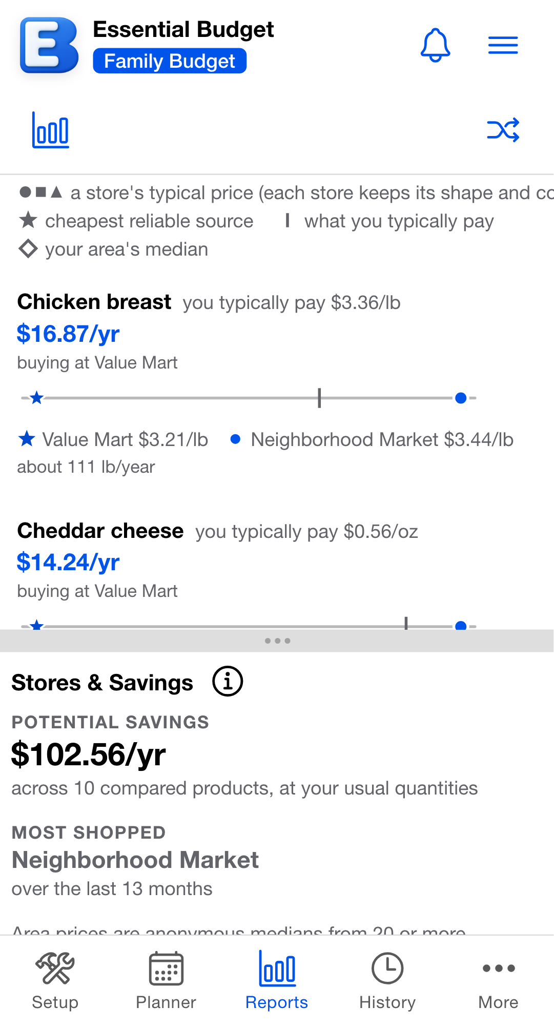
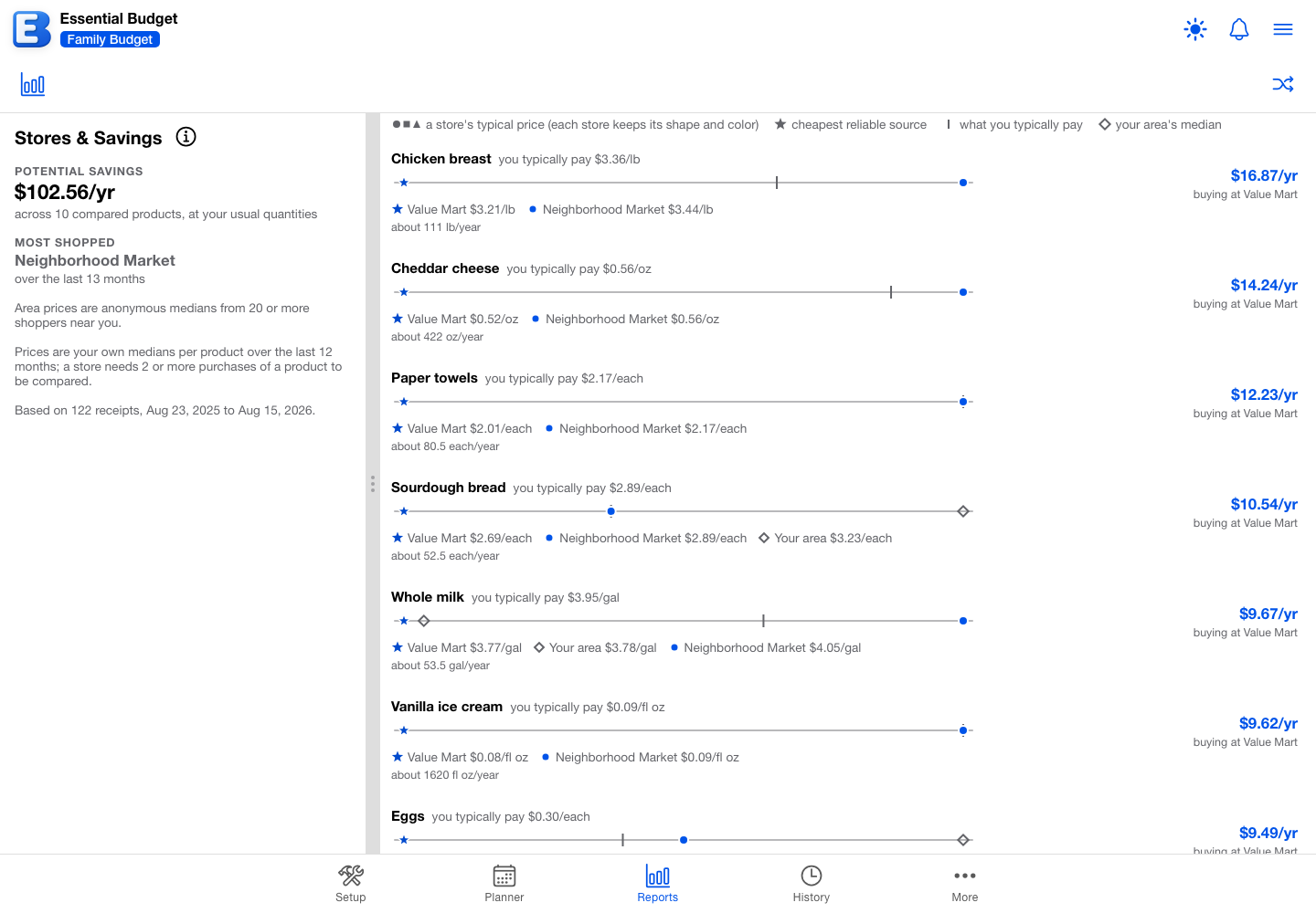
The savings estimate is honest about its basis: it uses only your observed purchases (for example “about 48 gal/year”), never a projection from a week of data.
Area Prices
Area Prices is the community report: the products with published prices near you, each with the area’s typical price per unit, how that price changed over the published weeks, and, for products you buy, what you pay beside it. This is where scanning pays off even before you have much history of your own. The area’s prices cover products you have never bought, so you can plan where to shop and watch local prices move. Contributing is optional and off by default; see Community Prices for how to take part and how your privacy is protected.
Pick a product from the list to see its weekly chart: a line for the area’s typical price, a shaded band for the middle range of prices, and a dashed line marking what you typically pay. The gear button switches the report between Country, State, City, and ZIP code; a level still gathering contributors reads “still building” until it publishes.
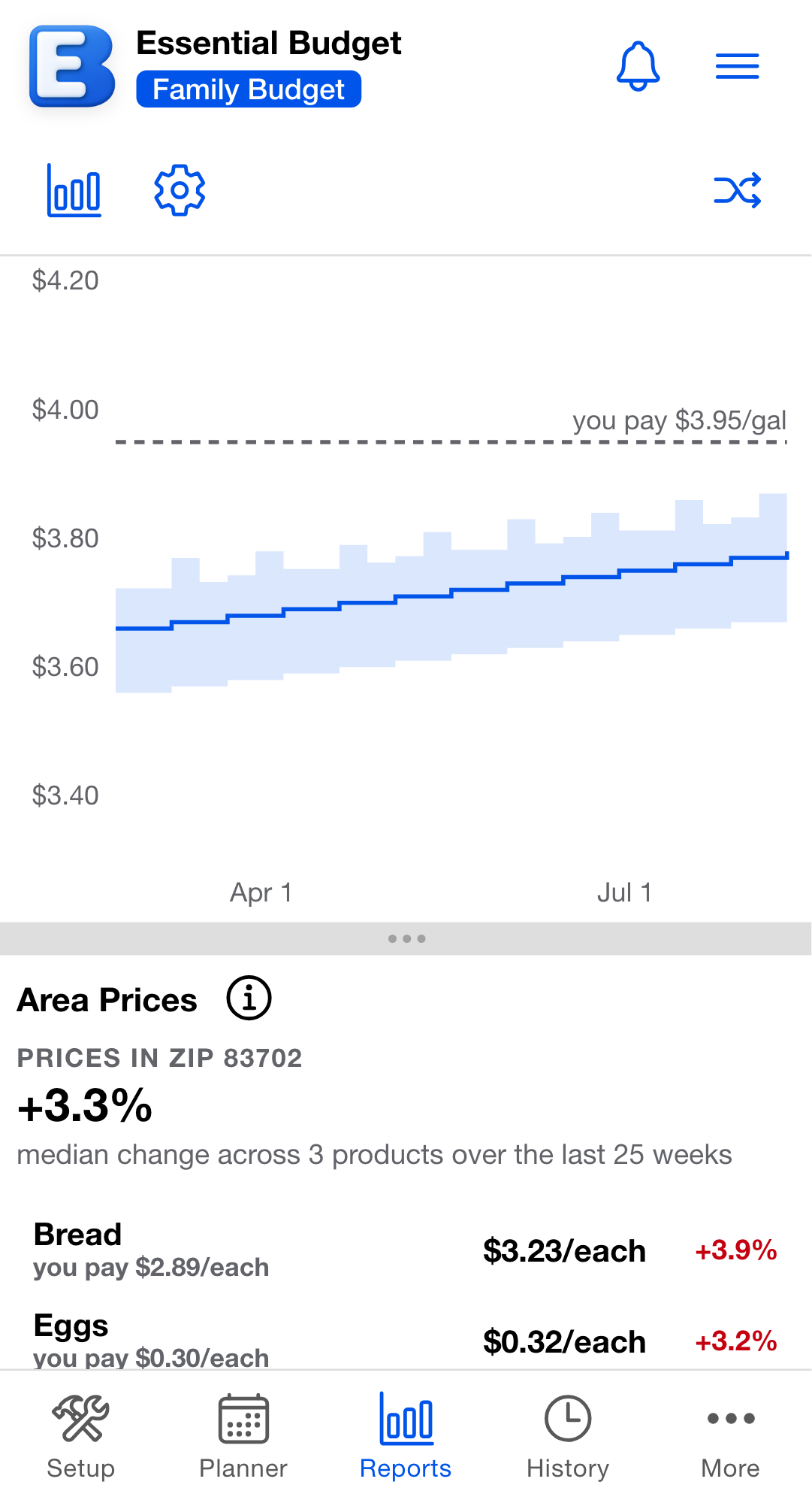
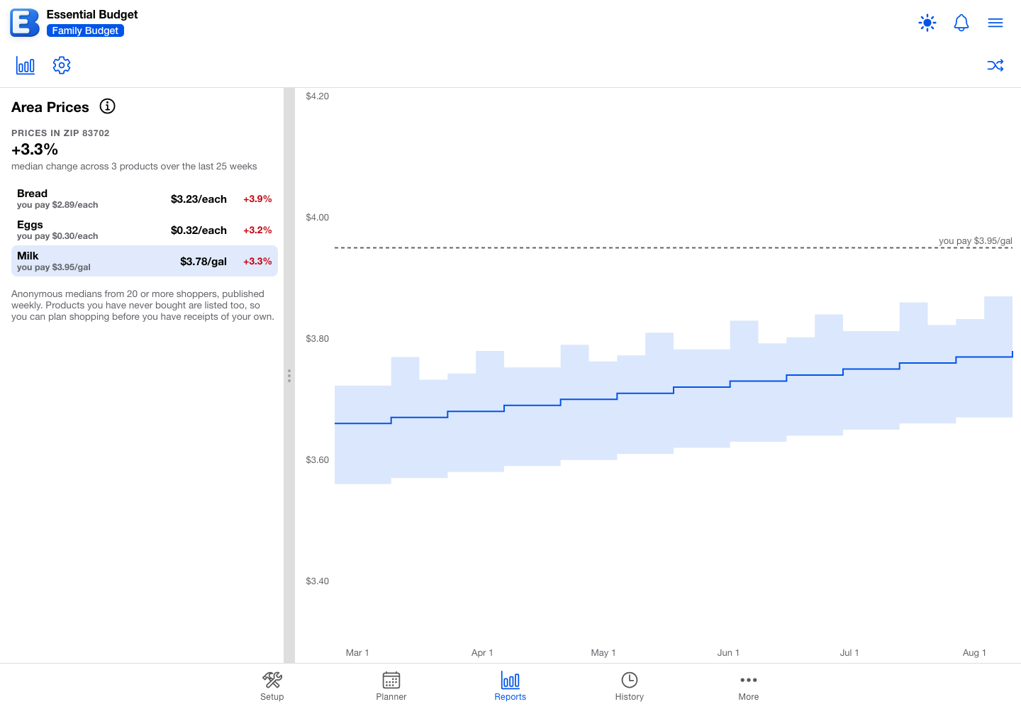
The summary at the top (“Prices in Boise”, for example) is the median change across the area’s published products. It appears only when at least three products qualify; until then, it reads Building. A product’s own change percentage waits for four published weeks.
If your area does not have enough contributed prices yet, the report says so, with your progress toward unlocking your area and a Sharing settings link. The more neighbors who contribute, the sooner local prices appear for everyone there.
Recaps
Recaps is a shareable summary of your grocery spending, one period at a time. It is a report of its own under the Receipts group; open it from there, or tap View recaps on the recap card in the Overview report. The date range control works like every other report’s: choose Monthly or Yearly as the period, and use the arrows to move between periods, up to five years back. The side panel shows the period’s counters (Tracked spend, Items bought, Stores visited, and Receipts), and the cards walk through the rest: your top products, your price movers, and a few highlights, like the item you bought most often.
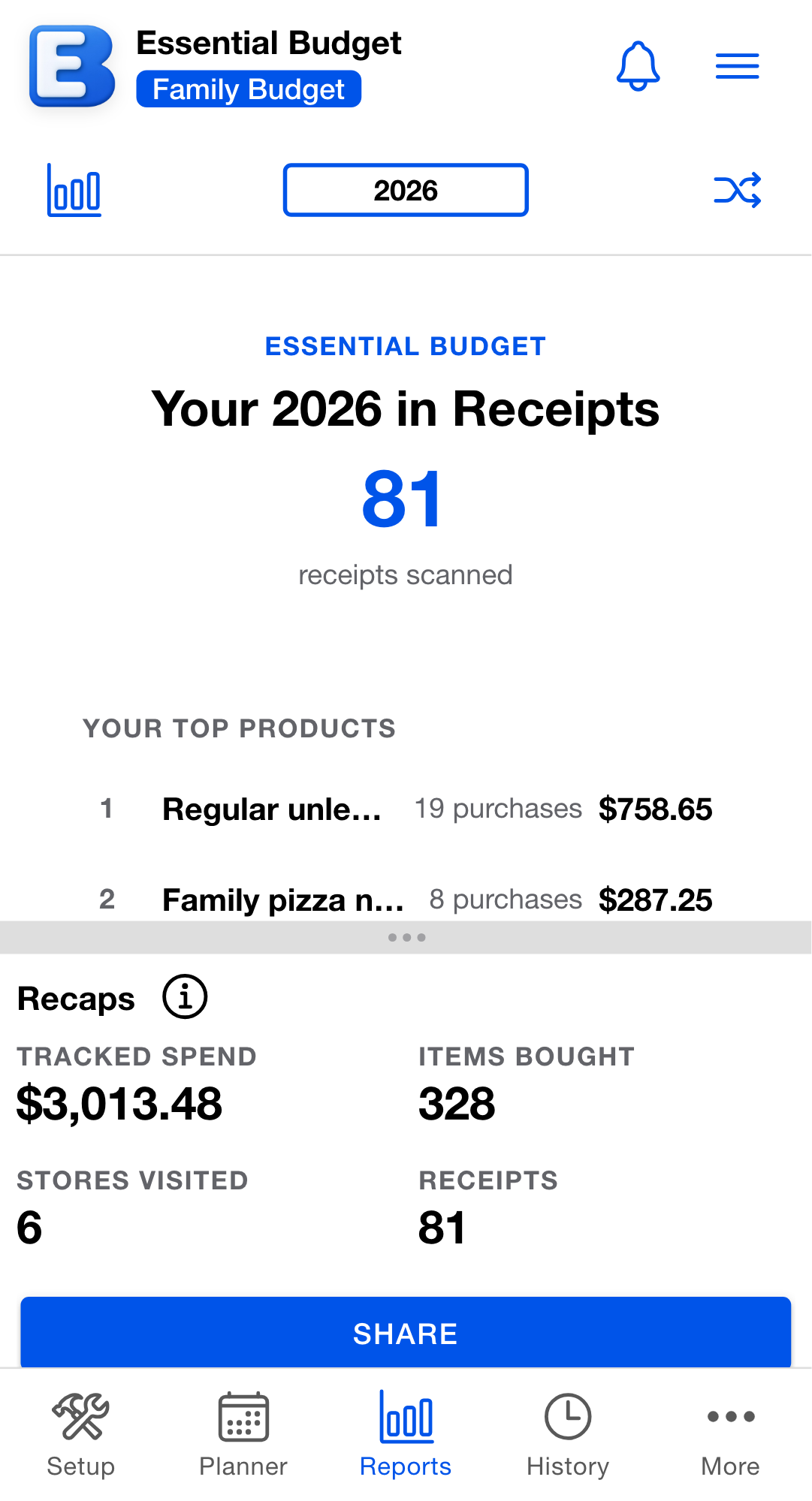
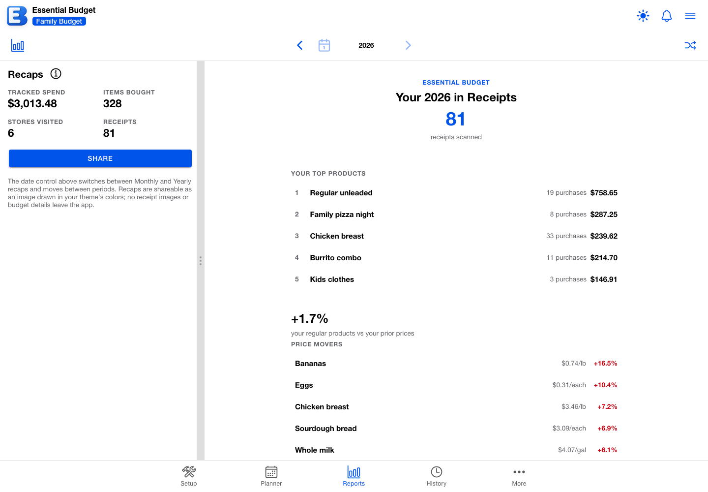
Tap Share to turn the recap into an image, drawn in your app theme’s colors, and send it through your phone’s share sheet to a friend or to social media. The image goes out with a short caption drawn from the recap (its counts, plus “Tracked with Essential Budget.”). No receipt images, transactions, or other budget details leave the app.
Recaps are free for everyone, and you can share any of them. Early in a month, before you have scanned much, the recap invites you to scan a few more receipts instead of showing thin numbers.
Why does a recap wait for a few receipts? A recap of one or two receipts is not a picture of your month. Until you have scanned enough, it shows how many more receipts will fill it out, so the numbers it does show are worth sharing.
The app can also tell you when there is something to see. In notification settings, Lowest price alerts tells you when a grocery item hits the lowest price you have seen, and Year in Receipts tells you when your annual recap is ready. The two share a ceiling of two receipt notifications a calendar month (the annual recap arrives once a year), and you can turn either off at any time.
Questions or feedback about this page?Email us.